Food Swipe approached us with the need for a complete brand identity and a mobile interface design that brings their concept to life. They wanted a brand that feels lively, approachable and instantly recognisable within the food tech space. The app needed to support simple decision making, allowing users to browse restaurant options without unnecessary steps or clutter.
They also required an interface that highlights restaurant images, quick swipe based actions and clear calls to action. The design had to focus on speed and simplicity while still feeling visually enjoyable. The goal was to create a user experience that reduces friction and makes discovering new food options an enjoyable process.

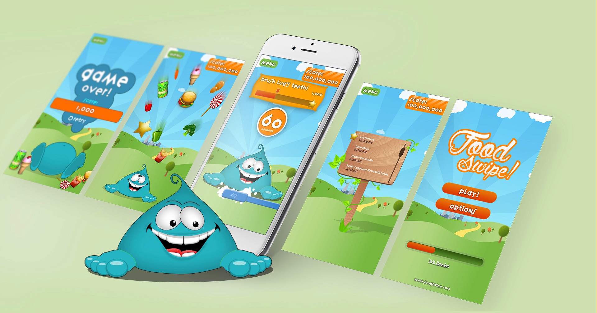
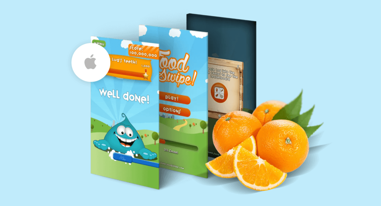
We delivered a bright and engaging brand identity that reflects the energetic and approachable personality of Food Swipe. The visual system uses friendly colours, modern typography and expressive elements that work effectively across digital platforms. The overall identity feels fresh and memorable, supporting the concept with strong visual clarity.
The mobile interface was designed with a simple and intuitive user flow that allows users to swipe, browse and explore restaurants effortlessly. The layout supports quick decision making and encourages engagement through clear visuals and easy navigation. The final design presents Food Swipe as a polished and user friendly dining companion.
To support the functionality and visual appeal of the app, we implemented a set of premium features designed to improve clarity, usability and brand impact.
Swipe Driven Interface Layout A simple navigation structure that encourages fast browsing and easy decision making.
Bright and Modern Brand Identity A visual system designed to feel fresh, fun and instantly recognisable.
Clear Call to Action Elements Structured prompts that guide users through restaurant exploration and menu browsing.
Mobile First Design System An interface tailored specifically for mobile usability and smooth interactions.
Next projects.
(2016-25©)