Colour Palette
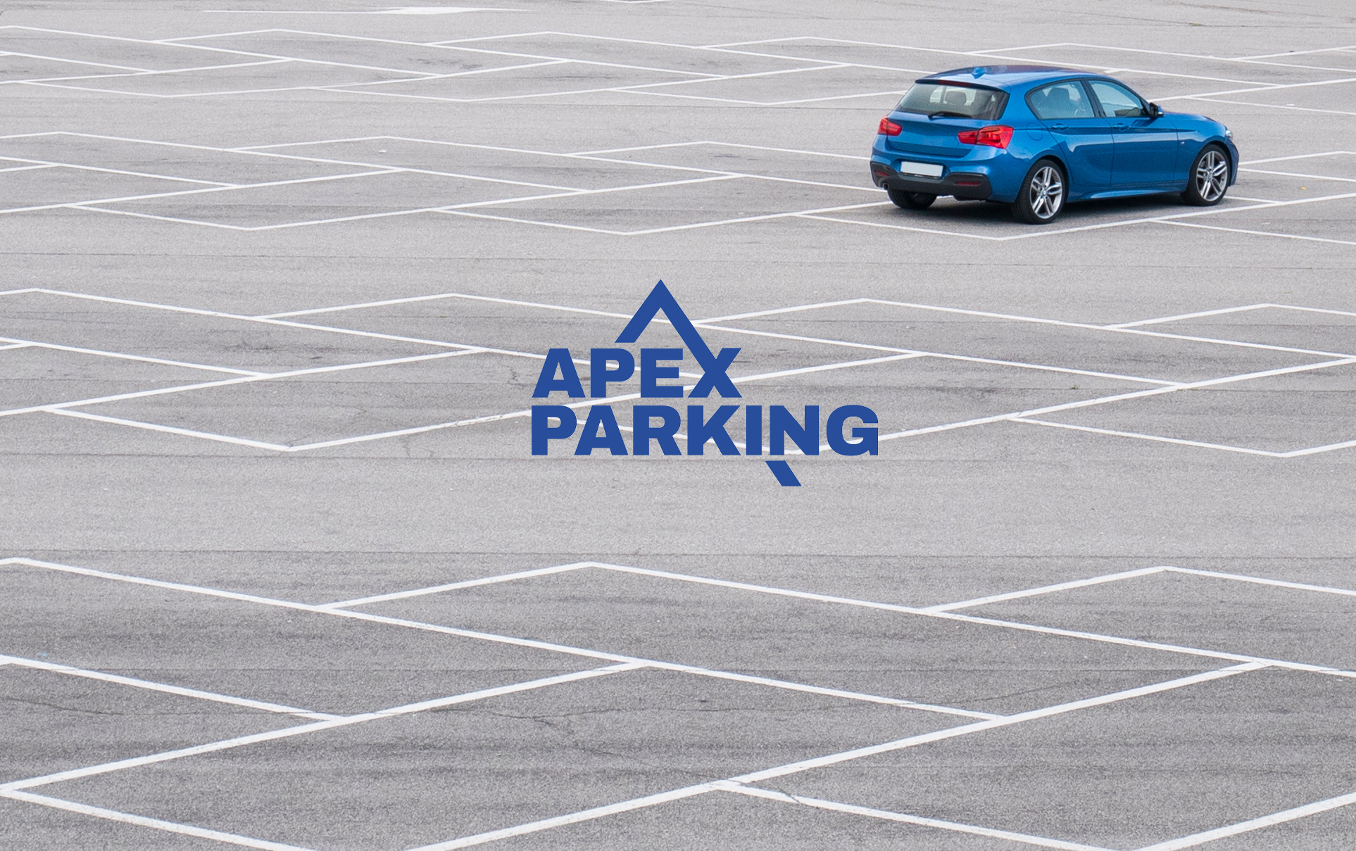
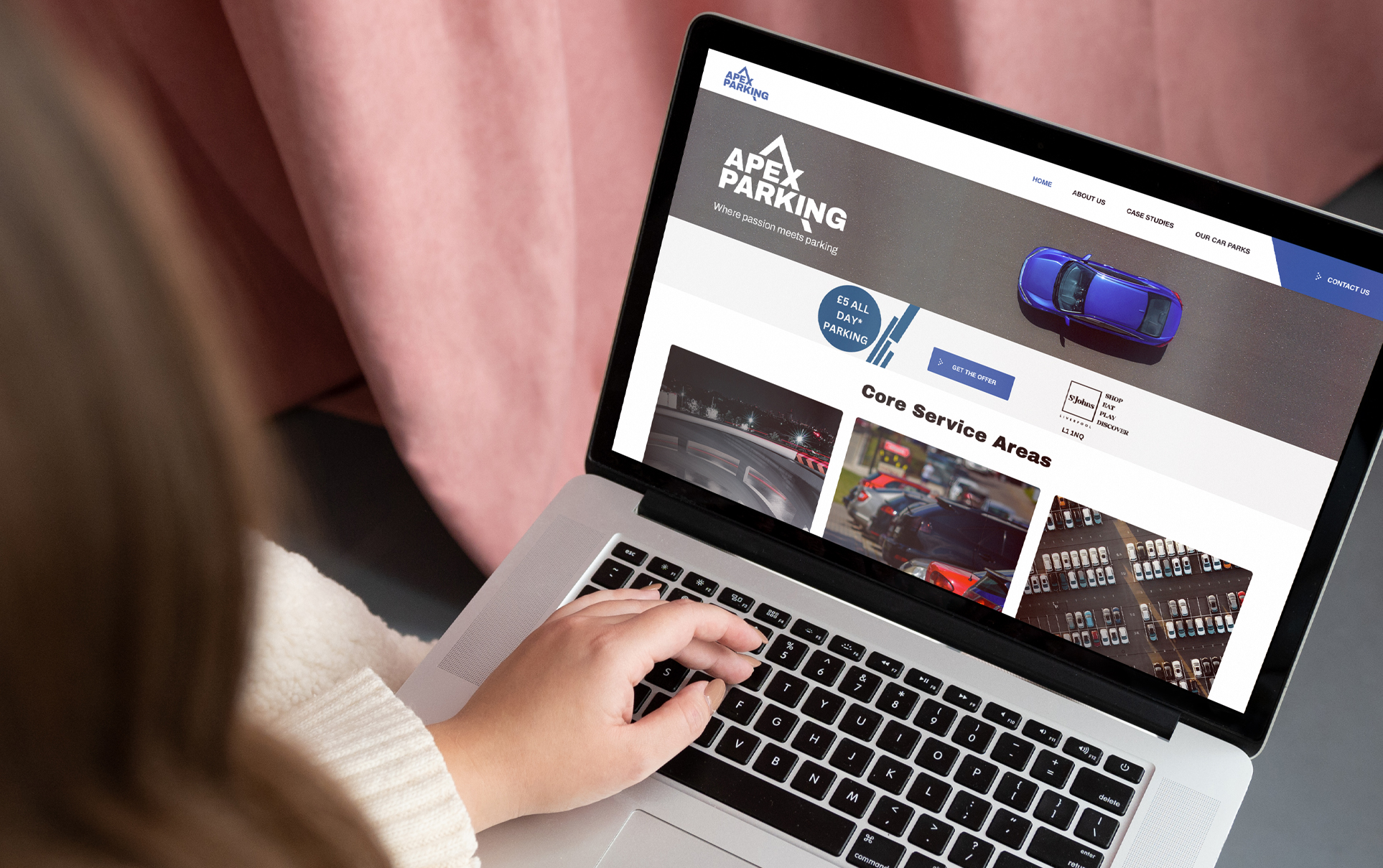
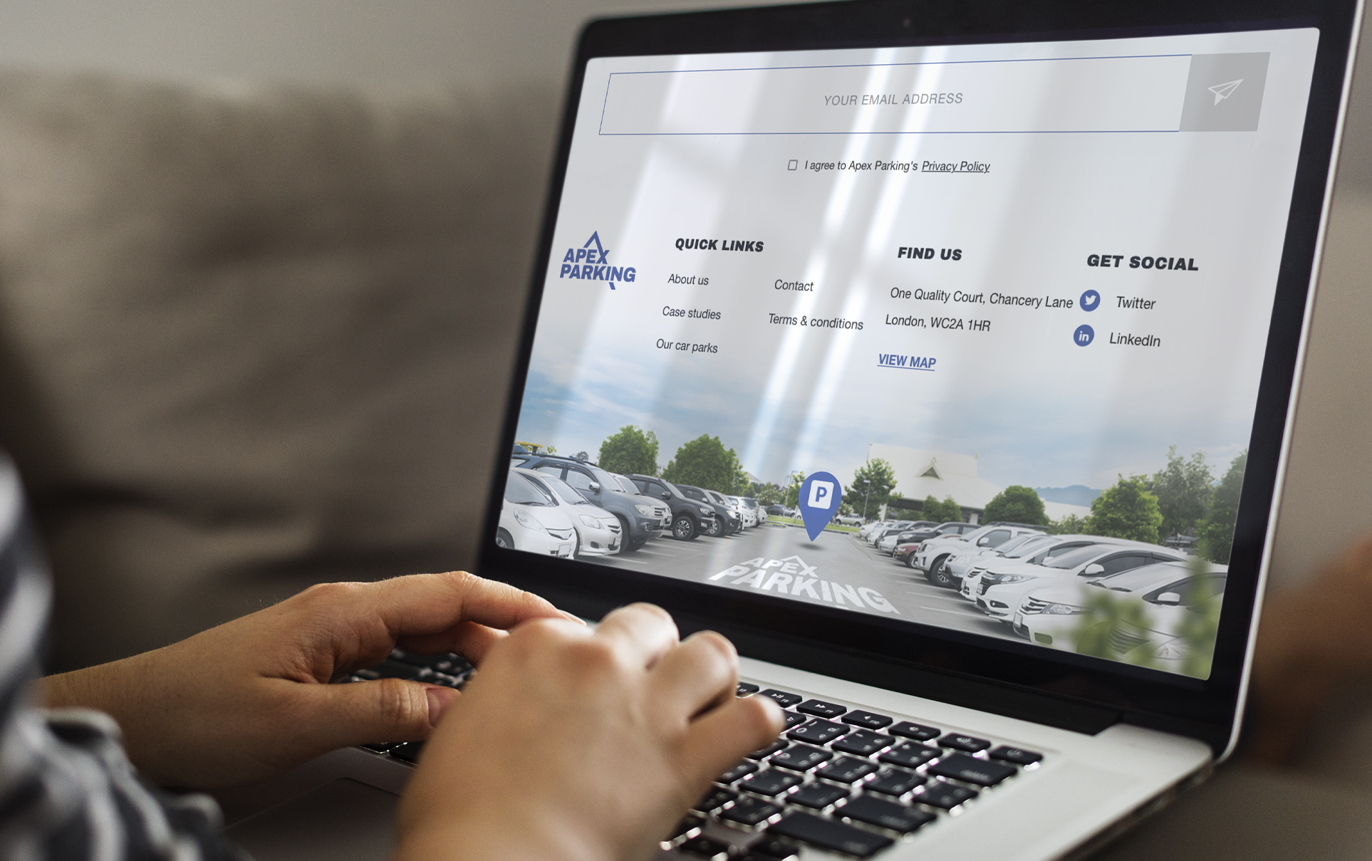
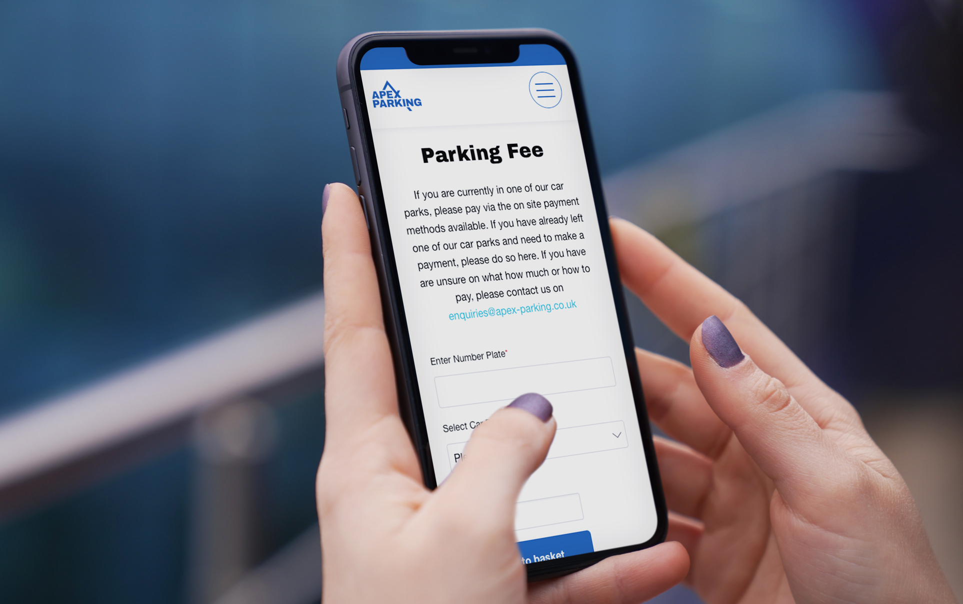
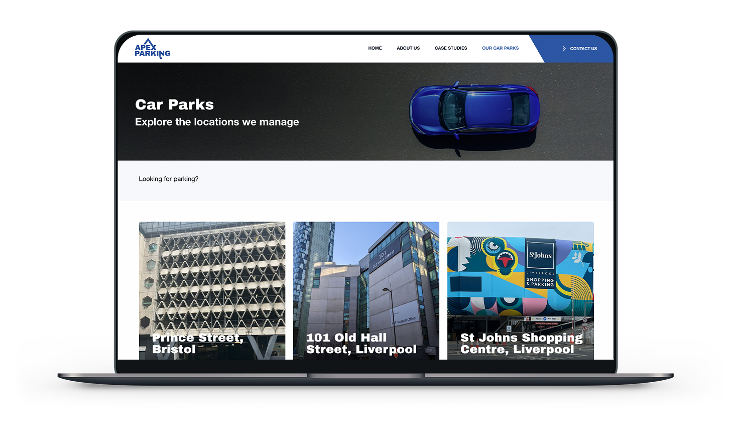
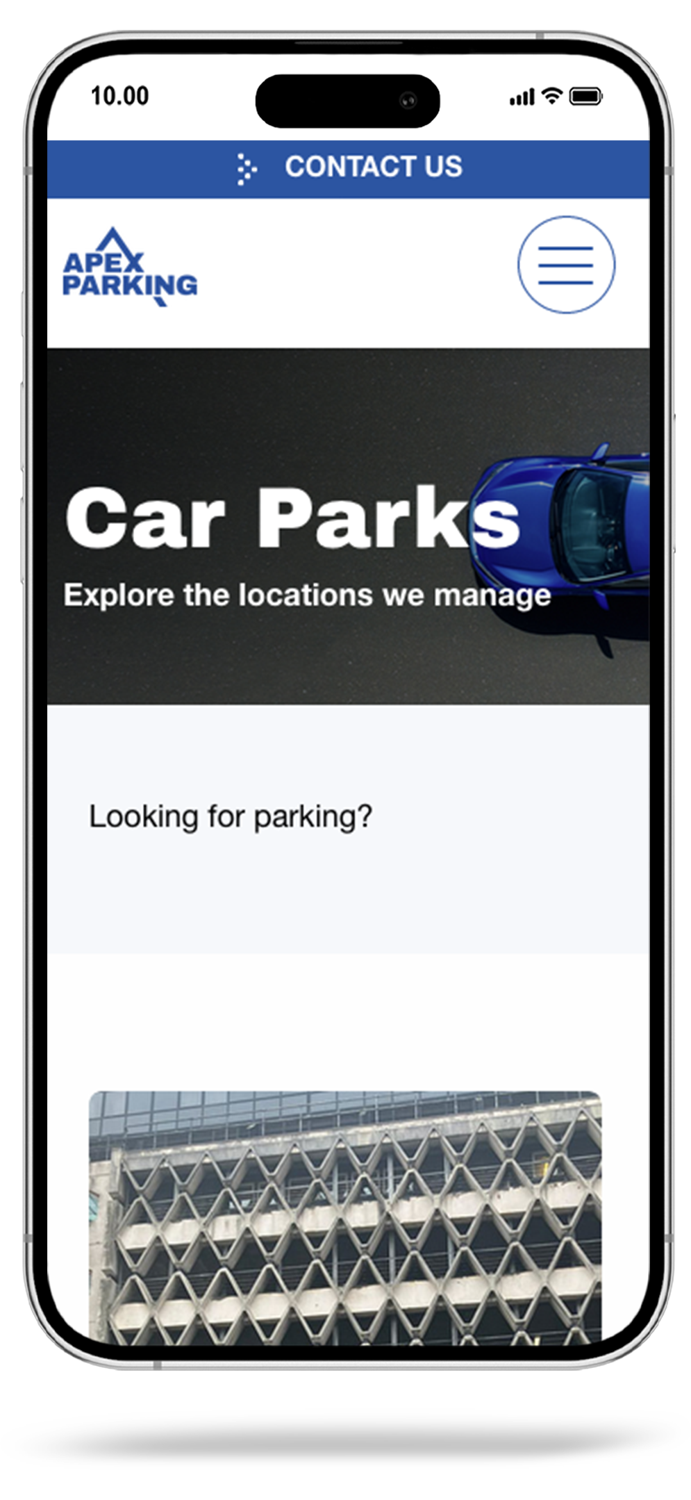
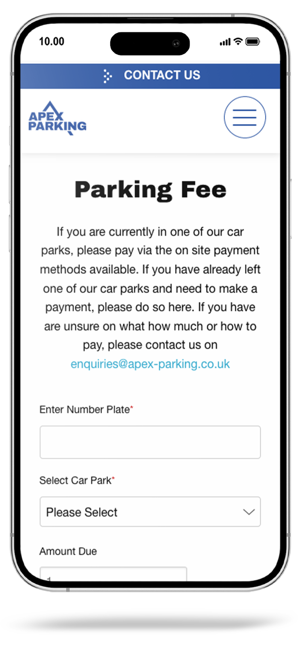
The choice of a blue and black colour palette for the website design was a deliberate decision to align with Apex Parking's brand image and goals. Blue was selected for its associations with trust and professionalism, crucial for a parking management company, while charcoal added an element of elegance and sophistication, positioning Apex Parking as a premium service provider. This colour scheme not only ensured visual consistency with the brand's offline materials but also enhanced user-friendliness and readability. Overall, the blue and charcoal tones were strategically chosen to reinforce trust, professionalism, and brand consistency, ultimately contributing to an appealing and cohesive online presence for Apex Parking.
